

This is my background research that I have related to my own work and how it will affect Genre, Narrative, Representation, Audience and Media Language.
- What is a trailer? What is its purpose?
I chose to answer this question as a written response which I then photographed using my iPhone and uploaded via the blogger app.

- Where might a trailer be seen? How will different formats affect the viewing of the trailer?
Trailers are the first look an audience have of the film, so it's important that they see it lots of times to register whether they like the sound/look of it. I have used the site 'bubbl.us' to create a mind-map of where a modern audience can view a trailer and which format it will be in.


- What are the genre conventions? - Focus specifically on the Horror genre and the sub or hybrid genre you have chosen.
For this question I uploaded a PowToon to look at the overall Horror Genre and then a PowerPoint presentation via SlideShare.net. that looks at the three main conventions used in horror films in more detail: Characters, Location and Sound. I chose to focus on these as they will require the most detail when planning to make my trailer.
- Analysis of 3 film trailers in my chosen genre (Sub Genre) in terms of style, music, stars, plot, editing, graphics, etc.
This is the full theatrical trailer for M. Night Shyamalan's 'The Sixth Sense' which was released in 1999. The star studded cast is lead by Bruce Willis, Haley Joel Osment and Toni Collette.
The Sixth Sense trailer uses it's style to tie in all other aspects of it's trailer, such as editing, sound and stars. The shot lengths are only a couple of seconds long each, however they allow the spectator enough time to notice the mise-en-scene is telling us the location is in America, the stars of the film and how the film will look to cinema viewers. The opening scene with the traffic jam sets up the narrative relationship between a mother and son, letting the audience become aware of the horror genre conventions and how the supernatural sub-genre will keep to audience expecatations of the son being able to 'see dead people'. A convention that is challenged is that the mother is disbeleiving and it is a male role that supports the child. The use of dramatic music to guide the pace and editing style is really smoothly blended into the shots and setting up a tension that we will expect in the film. It also creates a 'jumpy' sense of confusion through the aid of fades to black and fade in from white, which are in time to a heartbeat or the sound of a camera flash. This quickens the pace and leaves the audience feeling anxious and on edge. The constant medium close ups of the stars and two shots of them interacting highlights the strong cast and gives it a USP. Usually horror films feature 'unknowns' or new faces that an audience wouldn't recongise because if they were familiar with the stars back catalogue of work then the audience wouldn't be scared of what's happening because they would asscoiate the star with previous characters they have played. However, the acting is so convinvincing M. Night Shyamalan didn't have to worry when it came to casting. The stars within the film are slightly different to the 'normal' civillians that are depicted in horrors, the mother is a single parent and isn't placed in a 'damsel in distress' role, but still remains to be seen as a caring and concerned mother. Bruce Willis isn't your typical 'everyman' although he has a wife, he doesn't display the 'family man' role, but instead a loner in social situations and an instense workaholic. This challenge to conventional horrors makes the trailer more believable in how the narrative is structure and although it sways from the Hollywood horror model, and should be less scary because it's not so 'in-your-face' it has a more surreal edge and slightly worrying effect on the audience because it has more elements of reality and how we actually live everyday life, not how the studios represent this real life depicition which we can see is attempting to relate but really doesn't.
The choice of music emphasises the soun effects and ambience is created through intensifying natural noises of doors, cars, people talking and things that we can see on screen. The sychronius sound works well against what has been added by the editor to create a reality that seems somehow detatched and unnerving.
The plot isn't portrayed obviously in this trailer on purpose, as those who have seen the film will know that the ending relies on a shock twist and displaying a play-by-play breakdown of the film could give this away and reveal the masterpiece that has arguably made this a classic in film history. The way the plot has been concealed is through the use of music and editing to keep a rhymic beat and snappy sense of timing, which doesn't allow the audience to take a lot of dislogue in. The editing has a lot of hand in this, which is something that makes this trailer so intense and creepy to watch. It doesn't have a large amount of graphic work, the names of the stars is very basic in how it's show and only a few warps are used to show the mentality of the main protagonists mind. Apart from this the trailer relies on a lot of static shots and the mood of the lighting to create an atmosphere.
This is the full theatrical trailer for Peter Jackson's 'The Lovely Bones' released in 2009. The star studded cast is lead by Saoirse Ronan, Stanley Tucci, Mark Wahlberg, Susan Sarandon and Rachel Weisz.
The Lovely Bones trailer uses unconventional lighting for a supernatural film, the 'happy' depiction of family life however does play into how horrors usually begin to create a juxtapose with the horrific events that will unfold later in the film. The bright colours and mise-en-scene take the audience straight to the time of setting and give a sense of the 60's-70's era. The sublimninal hints of reds withing the opening of the trailer hint at lurking danger from the semiotics of colour coding.
The camera uses a variety of close ups, medium, long and two shots that pan and move with the camera to flow with the editing style chosen. These also help the audience understand the relationship between the characters whilst drawing the audience in with an interesting style and consideration for the aesthetics of the film. There is an unusual low angle handheld shot of Stanley Tucci's role which gives a manic shaky effect to intensify the drama. I like the variation in shots because I feel for my style of trailer
The music is a perfect aid in guiding the narrative to persuade an audience to feel for certain characters and emote at particular points. The delicate piano instrumental relates to the naive young mindset of children. The classical non-diegetic tone to the choice of soundtrack contrasts to the harsh and gritty ambient sound. As the pace picks up, the voiceover becomes more aggressive and the classical music becomes a grander orchestral piece. The sound of the photographs being taken links well to her personal dream of being a photographer and the police trying to uncover her case. The fast pace of sound cuts and the dialogue picks up with the rest of the diegetic sound such as smashing glass, phone calls and other 'real life' sounds gives a nice blur with the 'in-between' and Earth which is the theme of both The Lovely Bones and my own project.
The editing is closely linked to the cinematography and sound for a sleek and polished finished. This gives an impression of an impressive and well thought out take on the sub genre and delivers it differently to the usual hand-held 'found footage' style with over acting and dramatisations.
The characters all have their own unique focus within the plot which is really interesting from and audience perspective. The film blends single and multi strand narrative form to base a foundation on the protagonist Susie's journey and how this affects the stock characters 'The Father', 'The Mother', 'The Younger Sister', 'The Baby Brother', 'The Grandmother', 'The Love Interest', 'The Police Officer', 'The Murderer' these eight key roles play to the conventions of Propp's theory towards narrative. This is keeps it to the idea of a middle class family that are effected by a nasty event. In this case it varies from the usual spirit in supernaturals and instead uses the daughter's death to convey a convincing and emotional performance from each role. The different approaches to how the characters feel about Susie's situation gives it a more realistic feel to the usual take on super natural's.
The mise-en-scene is very connected to the era to signify to the spectator when and where it's set. The choice of colour and pattern gives insight to the fashion and interior trends to the decades in which the film spans. The location is shown through out the film and 'heaven' is depicted in an open and light spacious way to give the idea that Susie is 'free' and is fully grown. This metaphor is mirrored in the tree shown at the end of the film. Whilst on Earth the dark and gloomy style of lighting is a pathetic fallacy for the situation and how the family feel. This dim lighting helps us the audience understand that it is part of the horror sub genre as we are aware of the connotations of horror films having conventions of black, darkness, night time, emotional performances (normally crying) and a home in America from an idyllic town or location.
I think this style of trailer is a really clear example of how I intend to recreate my interpretation of the sub genre. I aim to use this as an original piece of inspiration.
This trailer is the only trailer to show the studio's name first. The previous two trailers I have looked at have shown the studio's titles second to a few shots before hand. However like The Sixth Sense it does have a similar feel of style in the way the lighting and editing is used to create a darker and more sinister effect. The pale and dark contrast in how the actors look against the lighting gives it a clear horror convention. The same way The Sixth Sense does it's cut together to emphasise the stars in shorter shot lengths and fades to black and white to help the beaty pace and intensity. This may be in relation to the fact that the film also relies on a similar shock twist ending and doesn't want to reveal too much of the narrative in roughly 2:20 minutes.
The cinematography uses zooms and pans, tracking shots and medium close ups to covey conversation, character emotion and response and mixes this with long shots and camera movements to show indications of place and time. I think this is shown in a similar style to The Lovely Bones to give it a professional and studio feel to the audience. The blend of camera angles and shots works well to the conventional supernatural films which feature repetitive styles of shot and angles leaving not much to our imagination. However Hide and Seek is a twisted version of the classic children's game so it uses unconventional takes on the genre to leave a lot to the audience's imagination (like a child would do), it also makes the film seem more sinister and scary as you're not used to the style and unaware of what's going to happen or come next. This makes the film far harder to make assumptions for, giving it a greater 'jump-factor' and more shock tactics, as normally we can sense when a cut, angle or shot is going to happen and can prepare ourselves and not be as scared when it happens. I like this way of filming as for my trailer I don't want it to look conventional and like any other horror.
The music is really effective in this trailer and cut together very well with the editing to make smooth transitions with the fades and jump cuts. I will incorporate this idea when editing my own trailer to give it a studio feel and appear professional. I like how the high pitched music starts from the second the trailer begins and how it appears to start with a voice over from Robert De Niro's character but it's actually just how the conversation has been overlapped and cuts to an over the shoulder shot with the 180 degree rule to show him conversing with a co-worker. This conversation is played at the same time the relaxing music is played giving a euphoric feel, whilst the calming and 'safe' female characters speak. The conversations are played over a montage sequence, then when a classic conventional child's laugh and the mention of 'Charlie' is introduced a until a juxta pose in the background music is used when Dakota Fanning's character starts talking. The classical and quiet the non-diegetic music changes to an eery, dark and grand crescendo which is repeated through out the 'dramatic' parts of the trailer. At the end the idea of counting in the game is a whispered voiceover by Fanning, the final title is played to the final climax of the music and we hear the diegetic convention of a door creaking and a silence which emphasises Fanning's line from the classic game "Come out, come out, wherever you are..." is the last sound we hear. I think this works really smoothly with the editing of shots and clean cuts that makes the music and sound almost undetectable in editing to the average audience viewer.
The editing at the start of the trailer features a sequence of long shots to set up characters, location the theme of isolation and we see briefly 'The Mother' with a soft focus of large amount of white lighting to present her in an angelic fashion so we know she's died. The cuts to lots of trees and 'country' fulfils horror conventions and as the daylight and women are shown the editing seems very steady to show how they represent 'safety' in the narrative. When the young girl is show she signals a change in pace and flow with fast and more edgy cuts, the fades are more obvious and the speed gives it a more manic and panicked feeling to show she is 'dangerous' making us as spectator's mistrust her and put faith in her father. This is a perfect set up for the shock twist ending. The conversation in the little girls bedroom is edited as a conversation but adds in flashbacks with a key prop being shot in a close up of the dolls face to give enigma's to the plot. I like this idea and want to use this with a lamp being turned off in mine. Throughout the trailer having different lamps switched off and then cutting to a reaction of my female lead. The edit in the trailer when the music drops and we see a tilt of De Niro's reaction, the fade to black and tilted zoom to the door is a really effective edit to highlight to the audience it features conventions of the horror genre. There are also inter titles to highlight the star cast and questions to leave a lasting question and impression with it's target audience.
The characters are a central focus through out the film, the relationship between the Father and Daughter is really important but they are never shown in a two shot as this may lead the audience to believe they are close and connected, which they aren't because of an invisible 'imaginary friend' Charlie. Although we never see Charlie we know as an audience he fulfils the classic horror genre conventions, this may be because we can't see him but because we know he is a spiritual force working through the child. This divide in how the Father and Daughter relate is shown in shot reverse shots and how 'the woman' is depicted as an obstacle between the daughter receiving affection from her Father. 'The woman' is presented clean cut, pretty and homely, someone we would associate with being a mother which is why she is depicted as a replacement from the child's Mother through her eyes. I won't use these characters or ideas in my own, however I still think it works well as a convention.
The mise-en-scene presents the conventional middle class America very well, with large houses and open spaces and clean and tidy environments. The slight lack of saturation gives it a drained look which can be linked to the horror genre. There are lots of creamy and light colours used at the beginning to contrast with the dim and darkness used in the second half. This is to show how safe comforts can change to scary tension through the work of 'Charlie' The relevance of how the trees are shown at the beginning shows going on a physical journey which will later become an emotional journey both ways between both characters. The car is blue to show that it is a man leading his child to safety, not a woman and that he is a single-father struggling with the maternal duties that women naturally respond to. This leads to him seeking comfort and conversation in 'The Woman'. I think this creates a nice balance between a studio driven film and a classic horror.
- How can elements of these trailers be used in creating my own? - Themes, characters, shots, sound, mise-en-scene.
This Prezi is a breakdown of the five topics I will need to cover when making my own trailer.
- How is the narrative portrayed in the trailers? Linear flashbacks, cross cuts etc. How could I use them in my trailer?
I answered this in a Venn Diagram so I could focus on which techniques are most common between the trailers, I have only included techniques which are prominent recurrences within the trailers and are see more than once. If the trailer has used it but it doesn't make a statement because it's only used once I have not included it. The main techniques that I could use that shall work in my trailer is: flashbacks, wide shots, one shots, medium close ups, establishing shots, fades, montage that will all be edited together with jump cuts to create a linear narrative of non-linear shots. This will show my sub genre in a similar way to conventional trailer that my target audience would recognise.

- Who is the target audience and how does the trailer appeal to them? Give examples and then look at how will this affect your trailer and its target audience.
I have hand drawn/written a mini mind map to look at the age and gender of the three trailers and the four biggest unique selling points they use to relate to the expectations and need of those target audience's. I uploaded the photo via my Blogger app.

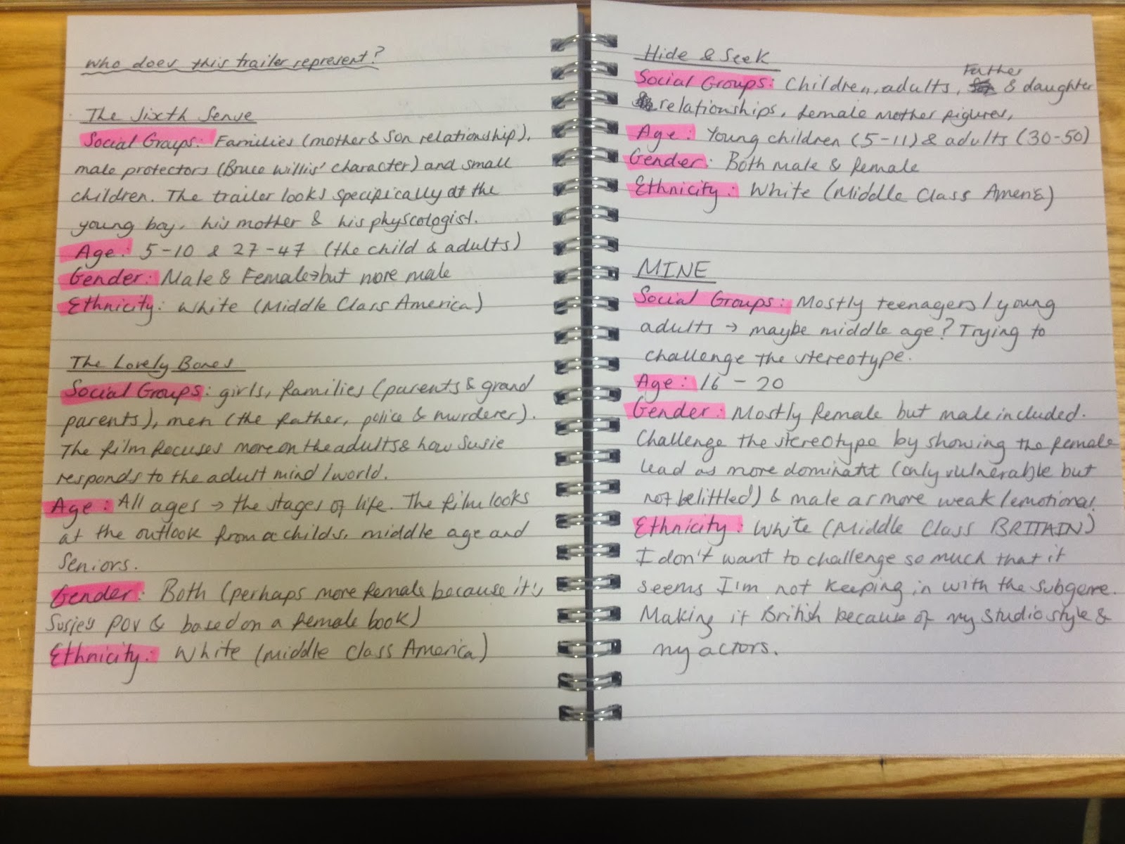
- Who does this trailer represent? Social groups, age, gender, ethnicity etc. Who will I represent in mine? (Consider stereotypes)
For this question I have chosen to briefly look over the general representations within all three trailers to get an overall view of my chosen sub genre and look at how I can maybe challenge these in my own trailer. I uploaded the photo via my Blogger app.

- What is the difference between a teaser and a full trailer? What is the idea behind a teaser? What should it do for the audience?
The idea behind a teaser trailer is to give a glimpse at what the film is going to 'be'/look like, it's to hook the audience in as quickly as possible and make them want to know more. It still covers the basic, who, what, where, when questions that a theatrical (full) trailer would but it does it in smaller snippets to gear the audience up for the full trailer release and get them on the films journey. It should create a sense of anticipation and excitement for the audience. Which means what it should do is make them part of the films release and get them wanting to see and hear more about it. The short length is enough to spark word of mouth and conversation about the film as free publicity. To look at the differences between a normal trailer and a teaser trailer I have made a table.
Theatrical
Trailer
|
Teaser
Trailer
|
A
slightly in depth look at how the film is visually
|
Briefly
show key shots or impressive locations, stars etc.
|
Covers
basic themes that might attract a broader audience
|
Show
the genre or 'type' of film it is from the mise-en-scene or editing
|
Lets
us know the basic plotline
|
Not
give the plot away but make us want to know
|
Makes
us aware of the intention of the film from a studio/director/both angle in
terms of genre conventions
|
Show
a style we might recognise from other studios or directors, this might hint
to the perspective of the film
|
Additional
information that we might find interesting (e.g. if it's a true story or
based on a novel etc.)
|
Basic
who's in it and when it's released/next trailer/website info for more to
come.
|
To
entertain and get us involved
|
To
make use want more involvement
|
Publicise
and market the film directly to its target audience
|
To
create buzz and hype in a short space of time to its target audience.
|
- Analysis of my 3 trailers posters, do they follow a consistent theme?


- Magazine cover for one of the three films, who does it include, what are the tag lines used, does it follow a consistent theme?
Unfortunately I couldn't find any magazine press related to my chosen film examples, so I have picked a magazine feature that is still within the same sub genre of my horror trailer and the examples I have used. It follows similarities in ideas and themes, presentation and overall feel.

No comments:
Post a Comment